Creating beautiful tables in R has never been easier thanks to the gt package. But what happens when your “simple” table suddenly needs three dimensions? That’s when things get interesting – and by interesting, I mean frustratingly complex.
Today, we’ll walk through creating a multi-dimensional table that displays relationship status by gender across different countries. We’ll start simple and work our way up to the challenges that make you question your life choices (and then solve them, of course).
Meet the GT Package
The gt package by RStudio is a grammar of tables that makes creating publication-ready tables surprisingly enjoyable. Think of it as ggplot2 for tables – it’s structured, flexible, and produces gorgeous output with relatively little code.
The package follows a layered approach: you start with your data, create a basic gt() object, then add layers of formatting, styling, and functionality. Each function adds a specific element to your table, making the code readable and the process intuitive.
If you’re new to R or finding this tutorial challenging to follow, I’d recommend checking out R for Non-Programmers for a more gentle introduction to R fundamentals.
Our Data: World Values Survey
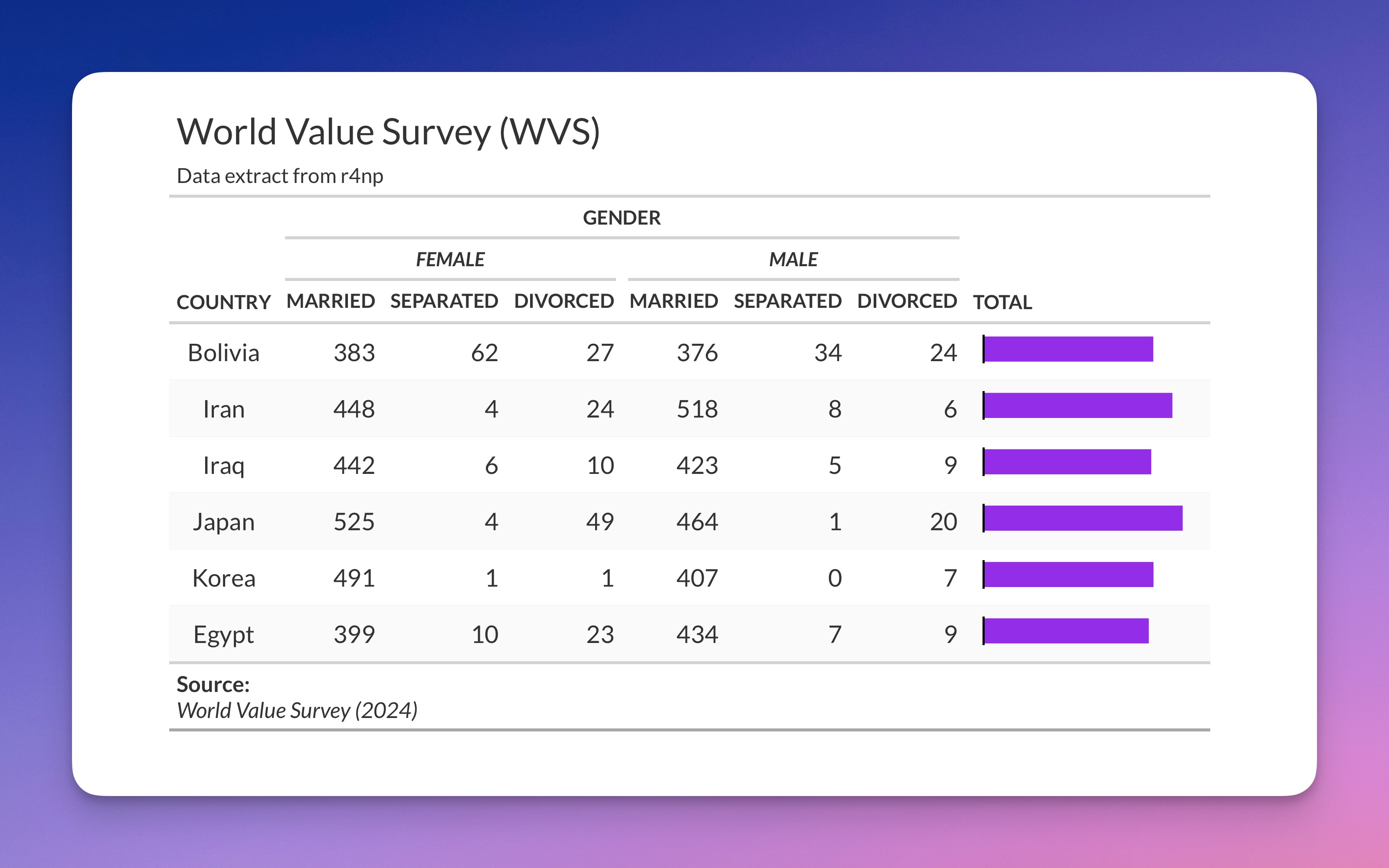
We’ll be working with data from the World Values Survey (WVS), which contains responses from people across different countries about their values and demographics. The wvs_nona dataset is a cleaned version where missing values have been removed (hence “nona” = no NAs).
If you want to follow along, you can get the dataset from the r4np package:
Our goal is to create a table showing the relationship between three variables: country, gender, and relationship_status. This is what makes it “multi-dimensional” – we’re not just showing a simple two-way relationship, but a three-way interaction.
Step 1: The Innocent Beginning
Let’s start with what seems like a straightforward task: create a table showing the count of married, separated, and divorced people by gender across countries.
First, we need to count the combinations of our three variables:
The count() function is doing the heavy lifting here. It groups by the three variables we specify and counts how many observations fall into each combination. The filter() step narrows our focus to just three relationship statuses – we’re keeping the analysis manageable.
This gives us a “long” format dataset where each row represents one combination of country, gender, and relationship status, with the count in the n column.
Now we need to reshape this data to make it suitable for a table. We want countries as rows and the gender-relationship combinations as columns:
pivot_wider() is the magic function here. Let’s break down what each argument does:
id_cols = country: This tells R thatcountryshould remain as a column (our row identifier)names_from = c(gender, relationship_status): These two variables will become column namesvalues_from = n: The values that fill the table come from thencolumn (our counts)
The result is columns with names like female_married, male_divorced, etc. R automatically combines the values from gender and relationship_status with an underscore.
Now let’s create our first GT table:
The gt() function creates the basic table object, and tab_header() adds a title and subtitle. Simple enough, but not very pretty.
Step 2: The Plot Thickens
Our basic table works, but it’s not exactly reader-friendly. Those column names like female_married are functional but ugly. We want to group them under gender headers with clean sub-labels.
“No problem,” you think, “I’ll just use tab_spanner_delim()!”
tab_spanner_delim() is GT’s convenient function for automatically creating column groups. It looks at your column names, splits them at the delimiter you specify (in this case, the underscore), and creates grouped headers.
This creates the gender groupings automatically by splitting on the underscore. The part before the underscore becomes the group header (“female”, “male”), and the part after becomes the column label (“married”, “separated”, “divorced”).
It’s clean, it’s automatic, and it… doesn’t let you customise the subcategory labels. You’re stuck with “married”, “separated”, “divorced” exactly as they appear in your column names.
What if you want “Married” (capitalised), “Sep.” (abbreviated), or “Divorced/Separated” (combined)? What if you want to style them with bold or italic text? tab_spanner_delim() just shrugs and says “take it or leave it.”
Step 3: The Manual Labor Solution
This is where GT shows both its power and its complexity. To get full control, we need to manually create our spanners and relabel our columns. It’s more work, but it’s infinitely more flexible.
Let’s break this down step by step:
Let’s dissect what’s happening here:
Step 1: Individual Gender Spanners
This creates a spanner (column group) labeled “female” that covers all columns starting with “female_”. The md() function allows us to use markdown formatting – in this case, italics with the asterisks.
The starts_with() function is a “tidy select” helper that selects columns based on their names. It’s much more reliable than typing out column names manually, especially when your column names follow a pattern.
Step 2: Overarching Spanner
This creates a higher-level spanner that encompasses both gender groups. The columns argument uses a vector of prefixes to select all columns that start with either “female_” or “male_”. The id = "gender" gives this spanner a unique identifier that we could reference later if needed.
Step 3: Column Label Customisation
Here’s where the magic happens. cols_label() lets us rename columns, but it also supports conditional renaming using the ~ formula syntax.
country = md("**Country**"): Directly renames the country columnends_with("married") ~ "Married": This says “for any column that ends with ‘married’, rename it to ‘Married’”
This pattern-based renaming is incredibly powerful. Instead of writing:
We can use the formula syntax to apply the same transformation to multiple columns at once. The results is pretty respectable.
Step 4: The NA Problem (Plot Twist!)
But wait, there’s more! Let’s add a total column to show the sum across relationship statuses:
Let’s break down that mutate() line: - select(., -country): Selects all columns except country (the . refers to the current data frame) - rowSums(): Sums across columns for each row - mutate(total = ...): Creates a new column called total with these row sums
You might notice some countries have suspiciously low totals or NA values. That’s because rowSums() doesn’t handle NA values the way you might expect – if any value in a row is NA, the entire sum becomes NA.
In our case, NA in the count data doesn’t mean “missing information” – it means “zero observations for this combination.” For example, if a country has no divorced males in the survey, that cell will be NA, but for our table purposes, we want to treat it as zero.
Step 5: The NA Solution
Let’s fix the NA problem properly:
This code introduces a powerful pattern:
across() for Multiple Column Operations
across() is a function that applies the same transformation to multiple columns. Let’s break it down:
where(is.numeric): Selects columns based on a condition – in this case, all numeric columns~ if_else(is.na(.), 0, .): This is a formula (notice the~) that defines the transformationis.na(.): Checks if the value is NA (the.represents each value)if_else(condition, true_value, false_value): If the value is NA, replace with 0, otherwise keep the original value
This is much more efficient than writing separate mutate() statements for each column, and it’s robust – if you add more numeric columns later, they’ll automatically be included in the transformation.
Step 6: The Full Solution Explained
Now let’s put it all together with detailed explanations and a little bit of flair:
Admittedly, this code chunk is a lot more substantial than going with the standard gt table setup, but it certainly looks a lot more audience-ready and accessible
Let me explain the final formatting steps so you can apply those changes to your own tables as well:
Visual Enhancement with gt_plt_bar()
This function from the gtExtras package adds mini bar charts to the total column. It automatically scales the bars based on the values in the column, making it easy to visually compare totals across countries. The bars appear within the table cells themselves.
Footnotes for Attribution
tab_footnote() adds a footnote to the table. The <br> is HTML for a line break, and again we’re using md() to enable markdown formatting for bold text and italics.
Theming with gt_theme_espn()
This applies a pre-built theme that mimics the ESPN sports network styling. The gtExtras package includes several pre-built themes that can dramatically change your table’s appearance with a single line of code. This is particularly helpful if you want to quickly apply a uniform style to all your tables in a presentation, report or publication.
Why This Approach Works
The manual approach we’ve taken here solves several problems:
- Flexibility: We can style each spanner and column label exactly how we want.
- Maintainability: The pattern-based selection (
starts_with(),ends_with()) means our code will work even if column names change slightly. - Scalability: If we add more countries or relationship statuses, most of the code will still work.
- Readability: Each step has a clear purpose and the code is self-documenting.
The Lessons Learned
Creating multi-dimensional tables in gt teaches us several important concepts:
Data shape matters: The structure of your data determines how easy it is to create your desired table. Sometimes reshaping is necessary.
NA handling is context-dependent: In count data, NA often means zero, but in other contexts, it might mean something else entirely. Therefore, we might have to amend our table values as necessary.
Pattern-based selection is powerful: Functions like
starts_with(),ends_with(), andwhere()make your code more robust, concise and less prone to errors.The
~formula syntax: This R feature appears in many places (cols_label(),across(),ggplot2) and is worth understanding deeply.Layered approach:
gt’s philosophy of building tables layer by layer makes complex tables a lot more manageable.
The GT package is incredibly powerful, but like any sophisticated tool, it rewards understanding its patterns and conventions. When your table needs go beyond the basics, don’t be afraid to break down the problem into smaller steps and build up your solution incrementally.
Want to Learn More?
- GT Package Documentation - Comprehensive guide with examples
- GT Extras Package - Additional functionality and themes
- R for Non-Programmers - If you want to strengthen your R fundamentals
The key to mastering gt (and R in general) is understanding the building blocks and how they combine. Once you grasp these patterns, you’ll find yourself creating publication-ready tables with confidence and in no time.
Happy table-making!